Start by assigning 5-7 specific colours to major life areas—blue for work, green for personal, red for urgent tasks. You’ll instantly recognise patterns and priorities without squinting at tiny text. Use colour gradients to show urgency levels: light yellow for casual events, deep orange for can’t-miss deadlines. Maintain consistency across all your planning tools, whether digital or paper. This visual system reduces mental processing time and changes overwhelming schedules into clear roadmaps—stick around for advanced techniques that’ll revolutionise your organisation.
While many people treat their planners like monochrome task dumps, you’re missing a powerful organisational tool that’s been hiding in plain sight: colour-coding. This simple visual system transforms chaotic calendars into crystal-clear roadmaps that your brain can process instantly.
Start by limiting yourself to 5-10 core colours—any more creates cognitive overload that defeats the purpose entirely. Assign specific colours to major life areas: blue for work commitments, green for personal tasks, red for urgent deadlines, and yellow for health appointments. The key isn’t being creative; it’s being consistent.
Once you’ve established these categories, stick with them religiously across all your planning tools. Your brain craves visual patterns, and colour-coding delivers exactly what it needs.
When you glance at your planner, distinct colours act as visual anchors that reduce mental processing time. Instead of reading every single entry, you’ll instantly recognise patterns and priorities. Red items demand immediate attention, whilst green tasks can wait until you’ve cleared urgent work.
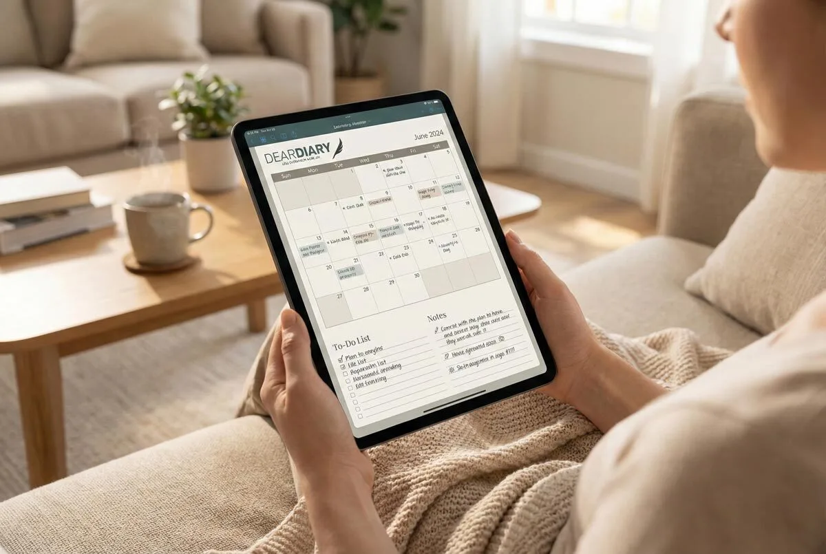
Digital planners offer unlimited customisation options that paper simply can’t match. Google Calendar, for instance, lets you layer multiple coloured calendars simultaneously. You can view work commitments alongside personal obligations without losing track of either category.
Use colour gradients to indicate urgency levels—light yellow for casual notifications, deep orange for approaching deadlines.
For maximum effectiveness, create broader categories rather than micro-managing every detail. Post-university life typically revolves around finances, fitness, social connections, and professional growth. Establishing these larger life areas prevents overwhelming your visual system whilst ensuring comprehensive coverage of your responsibilities. Don’t waste mental energy distinguishing between “grocery shopping” and “household errands”—just make them both green and move on.
Consistency becomes essential when you’re working with teams or family members. Everyone needs to understand that navy blue means meetings, regardless of who’s updating the shared calendar.
Maintain identical colour names across different platforms and resist the urge to rename categories seasonally. Your historical data becomes worthless if you can’t track patterns over time. A high-quality planner with hardcover durability ensures your colour-coding system remains intact throughout months of regular use.
Smart implementation means thinking beyond basic categorisation. Use colour families to group related activities—light and dark shades of the same hue work perfectly for primary and secondary priorities within each category. Grouping similar colours under families aids in performance tracking as you monitor which activities receive the most attention and effort. The monthly overview pages provide excellent space for implementing broad colour themes that distinguish different types of commitments at a glance.
Time-blocking becomes infinitely clearer when morning workouts appear in bright purple whilst evening gym sessions show up in deep violet.
Regular maintenance prevents your system from becoming cluttered and ineffective. Audit your colour assignments monthly, removing unused categories and introducing new ones as your priorities shift. That bright orange you assigned to your side project six months ago?
If you haven’t used it recently, retire it. However, maintaining this system requires consistent maintenance that can become time-consuming as professional responsibilities increase. A well-designed digital planner with 581 pages of structured layouts can provide the framework needed to support comprehensive colour-coding systems.
The real magic happens when colour-coding becomes automatic. You’ll stop consciously thinking about which pen to grab or which calendar layer to select. Your visual system will guide decision-making processes, helping you balance commitments and identify scheduling conflicts before they become problems. These colours act as mental bookmarks that accelerate information retrieval when reviewing your schedule. High-quality paper prevents ink bleeding that can compromise your carefully planned colour-coding system. Teachers particularly benefit from colour-coding systems when using class lists to track different subjects, activities, or student groups across their weekly schedules.
Transform your planner from a simple list into a sophisticated command centre that actually works with your brain instead of against it.
Frequently Asked Questions
What Colours Work Best for People With Colour Blindness or Visual Impairments?
Use blue/orange, blue/red, or purple/yellow combinations instead of red-green. Choose high contrast ratios above 4.5:1. Test with colour-blind simulators. Add patterns or labels alongside colours for better accessibility.
How Many Different Colours Should I Use to Avoid Overwhelming My Planner?
You should stick to 3-5 colours maximum to maintain clarity and avoid cognitive overload. Start with three for basic categories like work, personal, and deadlines, then add one or two more only if absolutely necessary.
Can I Change My Colour-Coding System After I’ve Already Started Using It?
You can absolutely change your colour-coding system after starting. Phase changes gradually, use dual systems temporarily during shifts, and update your colour key reference pages to maintain consistency throughout your planner.
What if I Run Out of the Specific Coloured Pens I Use?
You’ve got several backup options when your coloured pens run out. Use highlighters, washi tape, or planner stickers as temporary substitutes. Switch to digital apps with colour-coding features, or buy similar shades to maintain consistency.
Should I Use the Same Colour-Coding System Across All My Planners?
You should maintain core colours for shared categories like work and health across planners, but customise subcategories for each planner’s specific needs. This creates consistency whilst allowing personalised organisation.